Tactile signage
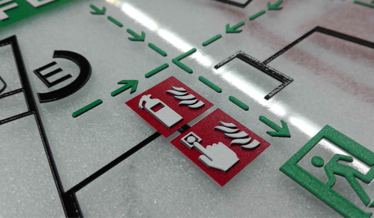
Barrier-free signage and guidance systems with braille and raised lettering for inclusion
Inclusion and accessibility through signage
In Germany, for example, the model building regulations and the Equal Opportunities Act for the disabled regulate signage in the interior and exterior of buildings. When it comes to compliance, we support you with our expertise from the planning phase onwards. Together with you, we then create a requirement profile as the basis for tactile signage with building plans and signs with Braille and raised profile writing.
TACTILE SIGNAGE
In the standards DIN 18040-1 “Barrier-free construction – publicly accessible buildings” and DIN 18040-2 “Barrier-free construction – apartments” based on the Disability Equality Act, it is regulated that structural systems are to be designed in such a way that they can be accessed without difficulty and are generally accessible and usable without outside help. This includes the structural and other facilities, means of transport, technical items, information processing systems, acoustic and visual information, and communication facilities as well as other designed areas of life.
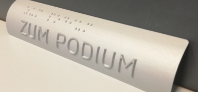
To achieve accessibility for the visually impaired, tactile signage and orientation systems are always provided with two types of fonts, which our product portfolio includes:
Braille
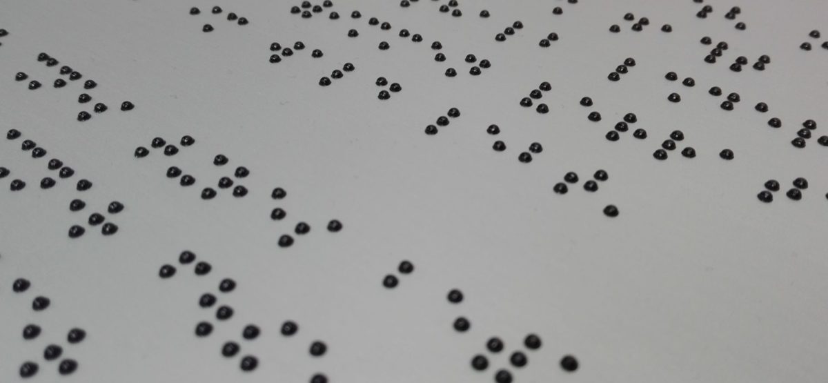
Braille was developed in 1825 by the Frenchman Louis Braille as so-called dot writing, in which six dots (three in height and two in width) form the grid for the dot combinations with which the letters are represented. In total, these six points result in 64 possible combinations, including a space.
Most people who can read Braille have been blind since birth or at a very young age, so they had to learn the font at an early age. DIN 32986 2019 edition regulates the standardization of Braille. Further detailed information is available in the “Marburg Systematics of Braille”, which is published by the German Study Centre for the blind in Marburg.
Profile font
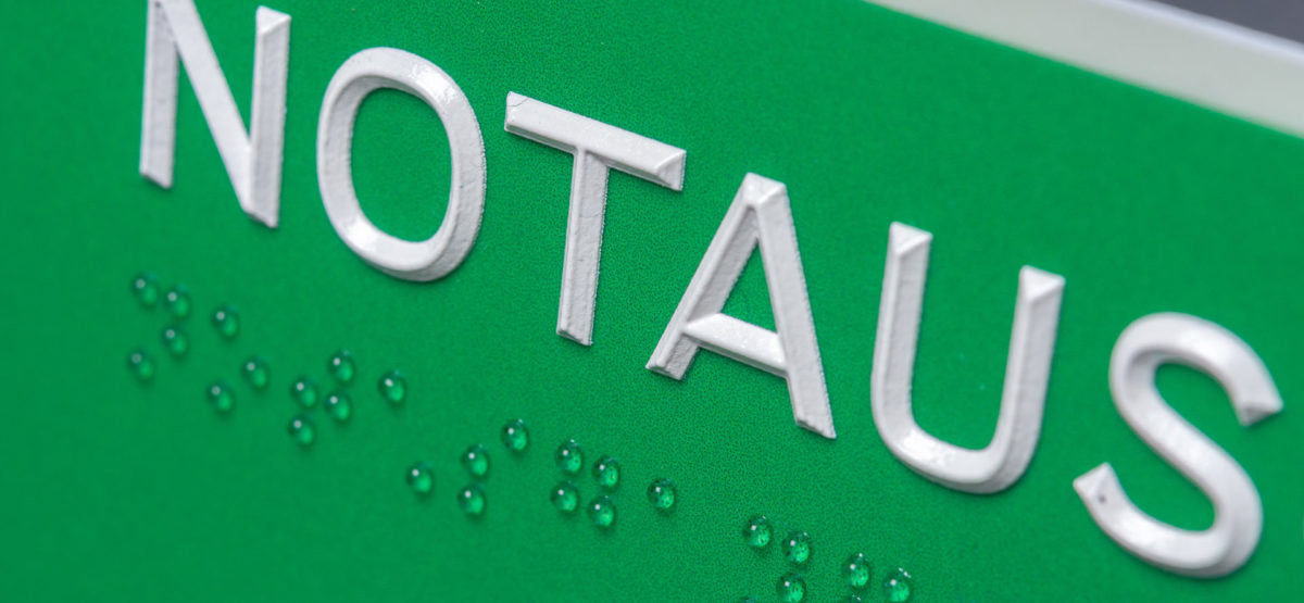
Profile font is a raised, sans serif font. Their profile cross-section is a prism shape with a slightly rounded upper edge.
The advantage is that all users are covered by this font. The blind can feel the writing, the visually impaired can read or feel, and sighted people can read the writing. In this respect, the pyramid font or profile font is particularly suitable for public buildings and facilities. The standardization also takes place in the DIN 32986 2019 edition.
A combination of Braille and profile writing is often used so that all users are really covered, and structural facilities are designed to be barrier-free.
International standards
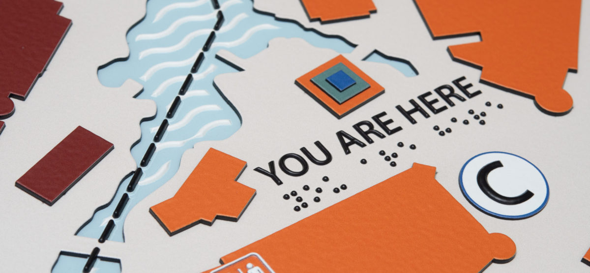
In addition to German standards, we also have extensive knowledge of international standards that are used in connection with barrier-free signage.
We are happy to provide you with signage that complies with the Americans with Disabilities Act (ADA). Through our subsidiary in the USA, we also have a broad portfolio in this area.
Further information
Do you want to find out more? Further information and inspiration is available for you to download in our catalogues. If you have any further questions, just get in touch with us!

